When you’re writing tutorials showing how to integrate with a service, such as I do for Twilio, or to show off the progress of your own app or service, do you include screenshots? If so, what do they look like?
I’m not the best frontend designer, granted. But, if I’m building a web app with a frontend, I believe in putting effort into how it looks, as well as any screenshots I take of it for when I write about it.
Okay, let’s be honest, I’m probably a little pedantic; though, gladly, no one’s ever said as much to me — yet. 😊
I do this, primarily, for one reason. Whether you appreciate it or not, screenshots:
- Sell people on what you write and on using your app
- Contribute to the overall impression of the quality of your work
So, they should be both professional and appealing.
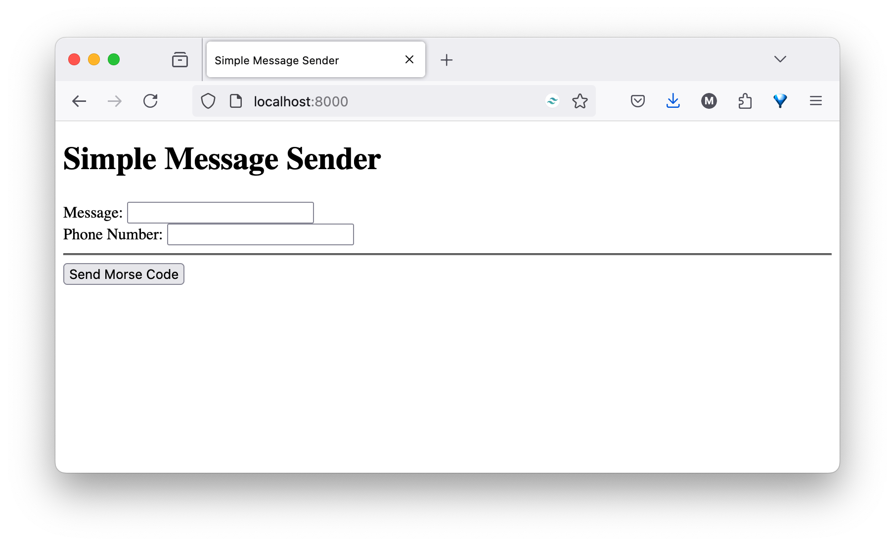
Consider the following screenshot, borrowed from a tutorial that I’m reviewing at the moment.

What does it convey to you? To me, the first one suggests that the app is, at most, at an alpha stage of development, that user experience is an afterthought — if it’s a consideration at all.
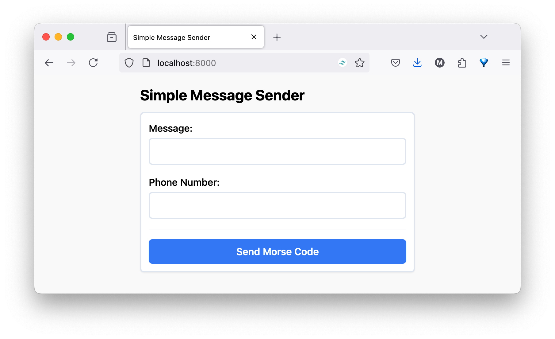
How about this one?

To me, it suggests that care and attention have been invested in the app, that it’s far further along in development, even, perhaps, ready for its initial release.
Sure, looks can be deceiving and, as the old saying goes, you shouldn’t judge a book by its cover. But, impressions count.
Why put so much hard work, care, and attention into the code, but let the UI be an afterthought? Yes, time is not always readily available, but impressions count — especially first impressions!
Matthew
Join the discussion
comments powered by Disqus