I admit that, in my formative years of writing software, I gave users scant regard. I wrote what I was told to, or what I thought I needed to.
Sorry!
What’s more, I also fell prey to the "more is better" mentality; a mentality that still pervades the software industry (and so many others). It was hardly ever – if at all – about the end user or about simplicity.
At least by my observation, it was quite common to feel that we, the software developers, knew what was best. After all, we are the super-smart technical people. Right?!
And, if you thought it was only software developers who did this, I've known more than enough systems administrators that, if only half-seriously, joked about their servers being perfect. "Oh, if not for users" they would opine. Then, everything would be fine.
Over the years, though, my perspective has changed!
Perhaps it's the time of life that I find myself in now. Perhaps it's enough years of using bad software, websites, and APIs, and becoming every bit as frustrated as anyone else. Perhaps it’s reading others' code, or looking back at what I've written in the past.
Sorry. Again.
Regardless, these days, good design is very important to me. Why? Consider for a moment if you’ve used software that was:
- Convoluted
- Had options that were hard to find, were poorly organised, or were poorly named
- Required numerous steps where fewer would have sufficed
Then, there are the more insidious examples. At first glance, they do largely do what they need to, without any sense of over-complication. But, on closer inspection, key features are missing or hard to figure out.
Let’s consider some real life examples
Apple Trailers

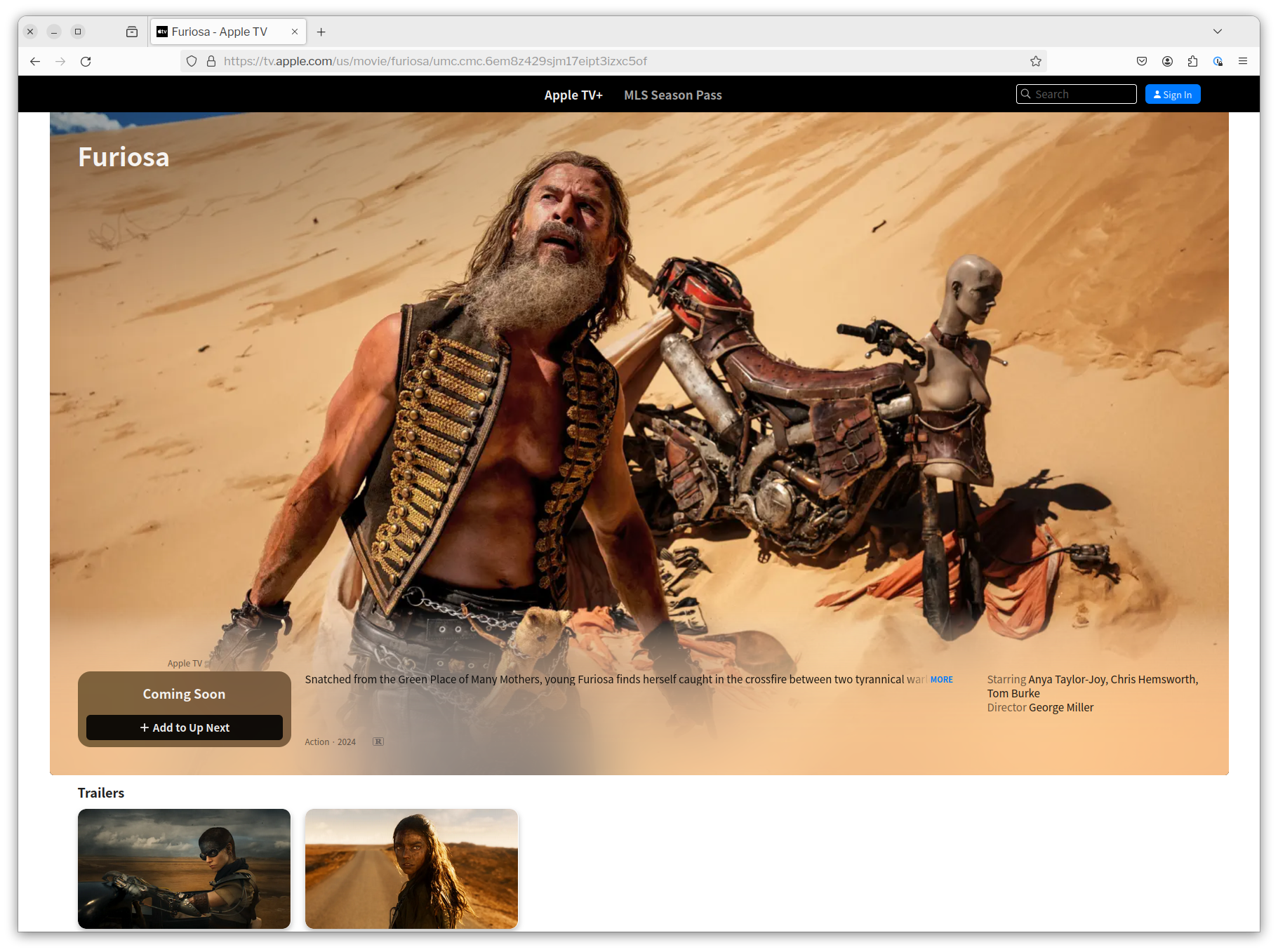
Take trailers on Apple Trailers, an example of which you can see in the screenshot above. If this is your first time wanting to watch the trailer, at first glance, how do you watch it?
Yes, there are two links to trailers underneath the main image. And, if you clicked either of them the respective trailer would appear and start playing.
But, would you know that, if you waited a little while, the main image would switch to be a video of the main trailer which would then autoplay? Doubtful.
Secondly, do you want to wait to start the video? Or, do you want to start it straight away?
Messenger and WhatsApp

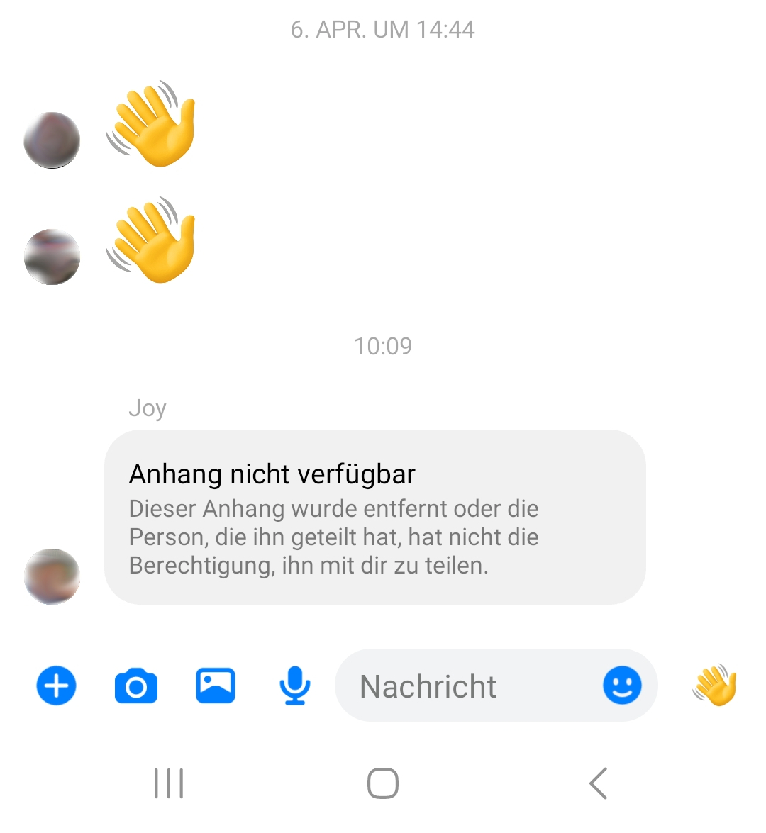
What about deleting apps in Messenger and WhatsApp? In the screenshots above, though in German, you can see that a previously sent attachment was deleted and is no longer available.
The message reads:
The attachment is not available (Anhang nicht verfügbar)
The attachment was either deleted or the person that shared it didn’t have the permission to share it with you. (Dieser Anhang wurde entfernt oder die Person, die ihn geteilt hat, hat nicht die Berechtigung, ihn mit dir zu teilen).
Question. If the attachment was deleted, why is there a message saying that? You didn't choose "Delete message and let others know". You chose "Delete".
That said, leaving a note behind may help others in the chat know, if they had seen the item and were wondering where it had gone, or if they actually had seen it at all. So, this functionality could be quite helpful.
However, it could also lead others to wonder why the message was deleted. Did someone have something to hide? Were they not confident standing by something they said or shared?
Either way, the wording of the option has to be updated to reflect the actual functionality, or the functionality needs to properly reflect the command.
There are worse examples, though...
While these examples are quite simplistic and, basically, harmless. I’m sure you can think of countless others that are far worse.

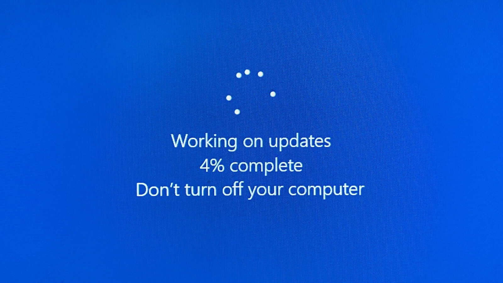
For example, Microsoft Windows Software Update.

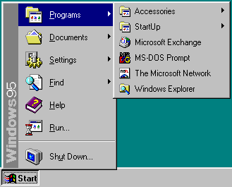
Or, having to click the "Start" button to shut down Windows in Windows 95, 98, etc. I never had an answer to why you’d have to do that, when my mum, as a new computer user, asked me, years ago.
And what about these examples?
Together, let's do better!
I’m tired of using software that looks and feels like no one really thought about:
1) What the user needs it for 2) If the user experience is accessible, logical, intuitive, and appropriate
I hope you are too!
Sure, this is more of a statement of intent on my part. I know that there will likely be plenty of times where I’ll need to use software that is poorly designed, and (if only in my mind) could have been designed better.
However, I’m writing this in the hopes of encouraging you, if you don’t already, to put more thought, time, and effort into the interface of the software you write.
I’m realistic enough to know that, as software developers, we’re not always given time to do this. There's a never-ending list of tickets to work through and meetings/stand-ups to attend.
What’s more, we’ve all experienced managers, project managers, and clients who, even for the best of reasons, may not appreciate the importance of proper UI design.
But, I want to encourage you to do what you can, when you can, all the same; to write software with well thought out user interfaces that lead to good user experiences.
 Are you tired of hearing how "simple" it is to deploy apps with Docker Compose, because your experience is more one of frustration? Have you read countless blog posts and forum threads that promised to teach you how to deploy apps with Docker Compose, only for one or more essential steps to be missing, outdated, or broken?