 Are you tired of hearing how "simple" it is to deploy apps with Docker Compose, because your experience is more one of frustration? Have you read countless blog posts and forum threads that promised to teach you how to deploy apps with Docker Compose, only for one or more essential steps to be missing, outdated, or broken?
I've been building web-based applications since 2001 for a range of different businesses and organisations. In that time, I've spent some time learning about website accessibility. But, to be completely honest, not all that much.
So, I'm aware of what it is, the available functionality, and why it's so beneficial. But, perhaps because I only have very limited physical disabilities, I've not invested all that much time building my accessibility skills.
Until now!
What's changed? Not a whole lot, to be honest. I don't have any new physical issues that I have to deal with or that have encouraged me to be more engaged with accessibility. I don't know anyone new with them, either.
What changed was building a small application recently, and sharing screenshots of it on LinkedIn, thinking that I'd done such a professional job of designing the UI. You can see it below.
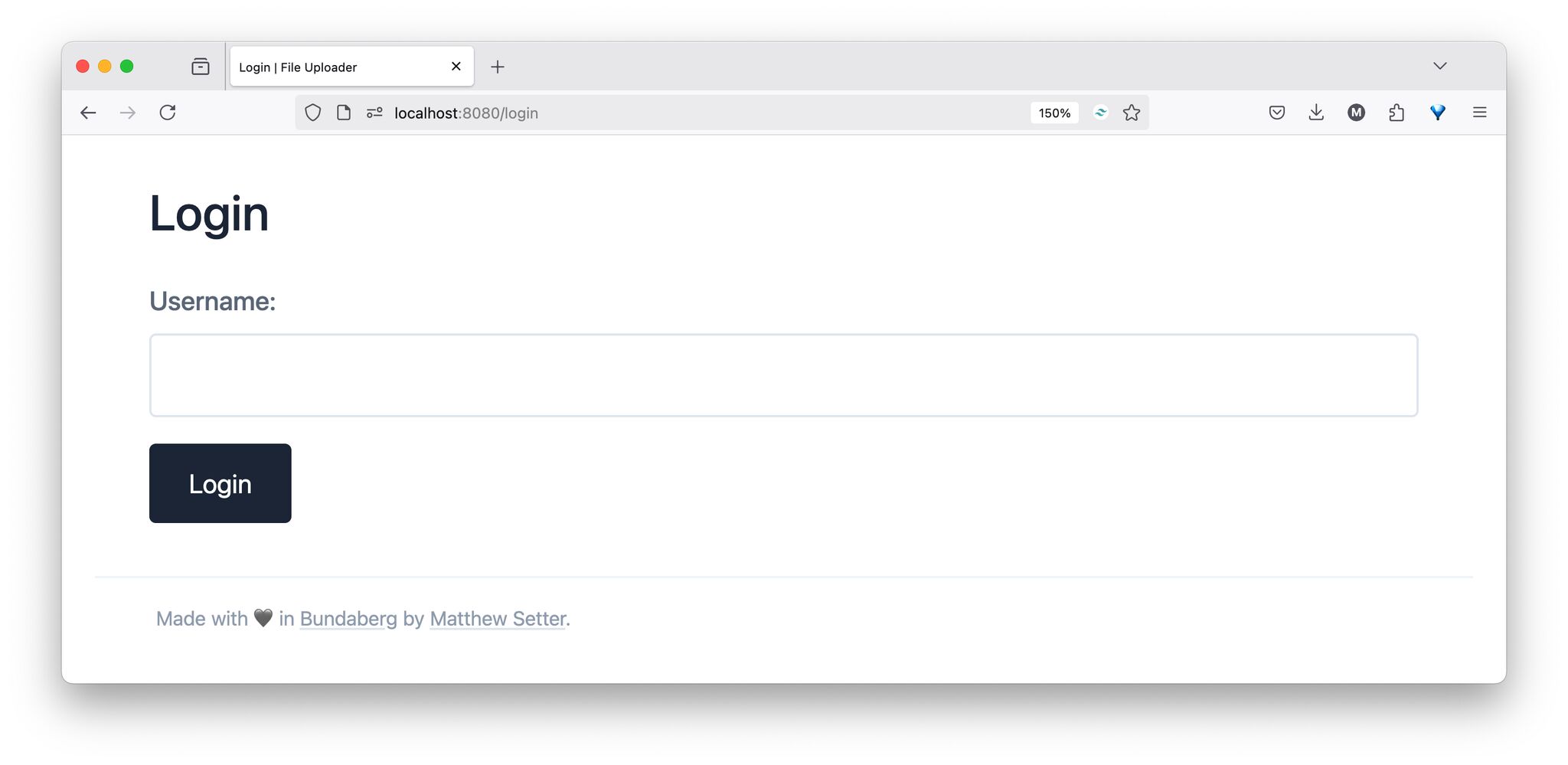
Initially, to my less-trained eyes, I thought that, while not amazing, it wasn't a bad design. You can see the application’s login form, containing a username field and a button to submit the form. Above the form is the "Login", stating what the form is for. And below the form is a footer showing that I built it here in Bundaberg, Australia.
From an aesthetic point of view, which is what motivated me to share the screenshot, you might think it’s fine. You might, as my friend Joschi pointed out, disagree:
I see a few weaknesses in the styled version: - The border around the input field is difficult to see (does not meet the minimum contrast requirements of 3:0). - The grey footer may also fail to meet the minimum contrast requirements (4.5:1), but I have not checked this. - The links in the footer are barely recognisable as such (the grey underlining is not high enough in contrast).
As the feedback points out, aesthetics is the wrong way to assess website accessibility. To be honest, I was quite embarrassed at the feedback that I received, yet have jumped on the opportunity that it’s presented me.
For complete transparency, I had intentionally lightened the text colour in both instances so as not to make it too harsh (black text on a white background, to me, doesn’t work). Secondly, I was aiming for a certain aesthetic look, rather than considering who might use the app.
My final criteria for assessing the page’s readiness was whether I could read it and whether I found it aesthetically pleasing. I hadn’t stopped to consider if it was usable by anyone else. 😔
How did I check the accessibility issues?
As I’m still a strong Firefox user (though that’s changing), I turned to Firefox’s in-built Accessibility Inspector, which comes as part of its Developer Tools.
Feel free to use Chrome's accessibility features or Safari’s Accessibility Inspector if you prefer those browsers, or the tooling in your browser of choice is, if you use a different browser.
To open it, all you need to do is right click on an element anywhere on a given page and click Inspect Accessibility Properties. Then, next to Check for issues, select "All Issues". You’ll then see any issues relating to colour contrast, keyboard accessibility, and text labels; the latter two I’ll focus on in a future post.
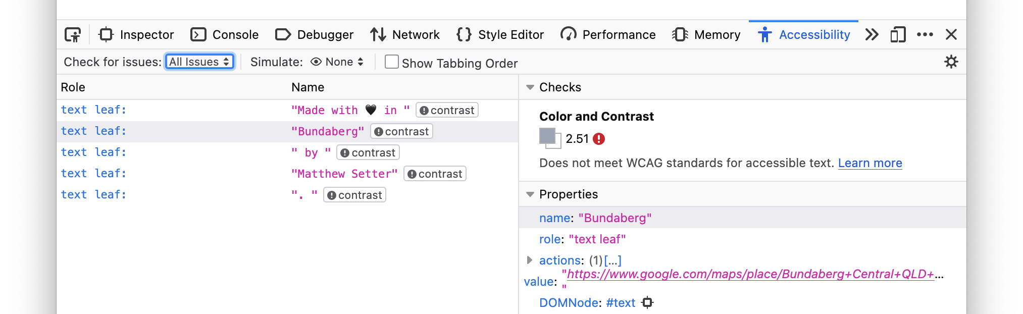
As you can see in the image above, Firefox found five issues with the text in the page’s footer. While the screenshot doesn’t show all that clearly which page elements the issues apply to, you can tell by looking at the text in the Name column. Then, in the Checks section at the top of the right-hand side of the Accessibility tools, you can see the issue.
There’s an issue with the "contrast ratio" of the text. Specifically, it does not meet WCAG (Web Content Accessibility Guidelines) standards for accessible text.
If this is the first time seeing the term "contrast ratio":
In WCAG 2, contrast is a measure of the difference in perceived "luminance" or brightness between two colors. This brightness difference is expressed as a ratio ranging from 1:1 (e.g. white on white) to 21:1 (e.g., black on a white). To give a frame of reference, on a white background.
Then, if you look at the colour contrast rules, you’ll see that the minimum ratio for body text is 4.5:1 (or 4.5 to 1). If you take a look again at the Firefox accessibility warning, the text has a contrast ratio of 2.51:1.
What this all means is that because the level of contrast between the text and background colours is too low, it will be hard to read for some people.
If your vision is pretty good, and you don’t have any issues with colour contrast, you might be wondering if this was a real issue that needed solving. However, as I’ve been learning while watching Developing Websites for Accessibility, the point is not to think about issues as yourself, but as others who have disabilities (I hope I’ve phrased that correctly).
So, to help you along, take a look at the screenshot below.
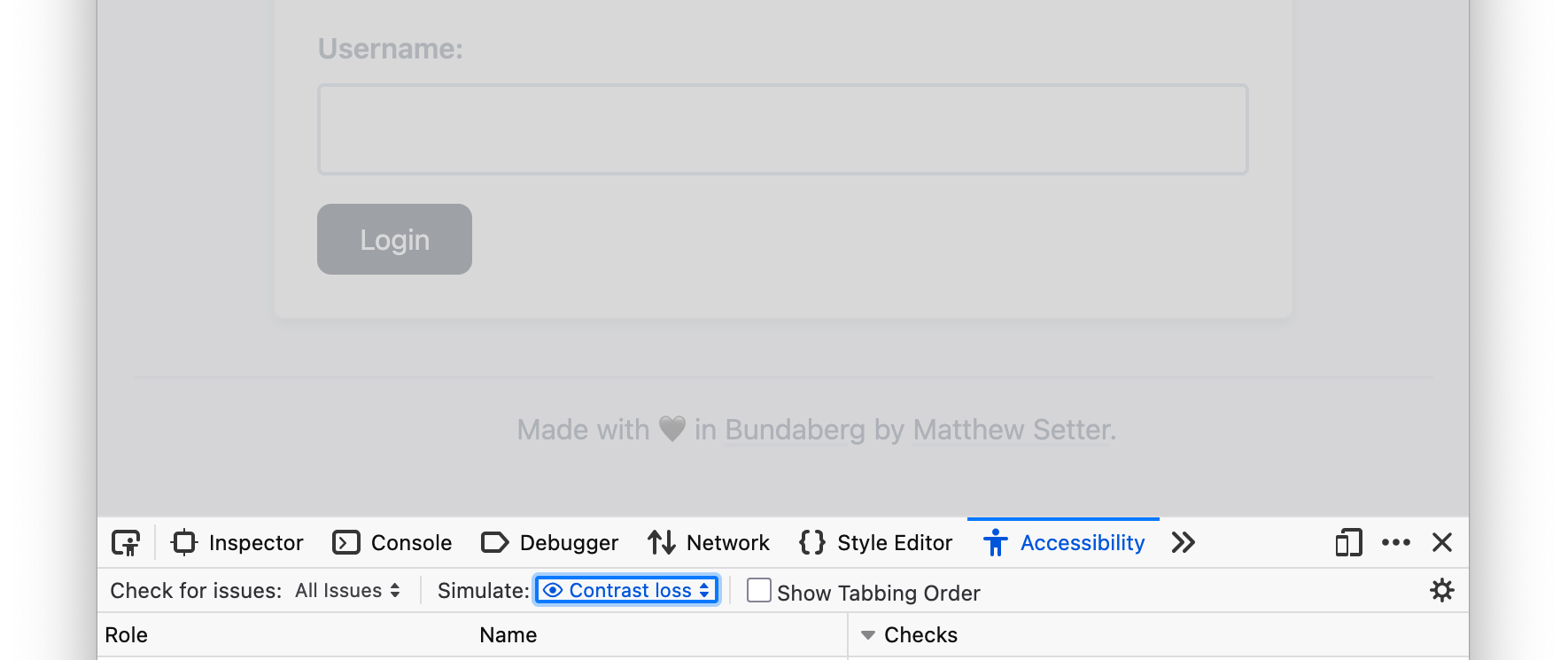
While it shows a later version of the page with better text colour contrast, imagine how hard it might be to read if the text were even lighter for someone who has trouble with colour contrast.
How did I correct the colour contrast issue?
Gladly, it didn’t take much to improve that, largely as I used Tailwind CSS as my front-end framework. All I needed to do was to change the text colour from "text-slate-500/65" to "text-slate-600/85". I also changed the username field’s border colour too.
In addition, I made two further changes:
- I increased the footer font’s size, with the intention of making it easier to read. I haven’t used any tooling to check if it was poor previously and better now. However, to my over 40 year old eyes, because of the contrast and size change, it’s easier to read.
- I reduced the amount of padding in the form’s submit button, and added more roundness to it. While this is perhaps purely a personal, aesthetic choice, I feel that the button is now more clearly a button, and not a massive block on the page.
Perhaps I need to do more. If so, please let me know in the comments.
Anyway, after checking the page again with Firefox Accessibility Inspector, the contrast ratio was now above the minimum level required. While a small step forward, it was still progress, and I’d learned a lot to get to this point.
That said, I felt that because of the accessibility improvements, from the user’s perspective, it wasn’t completely clear what they were meant to focus on.
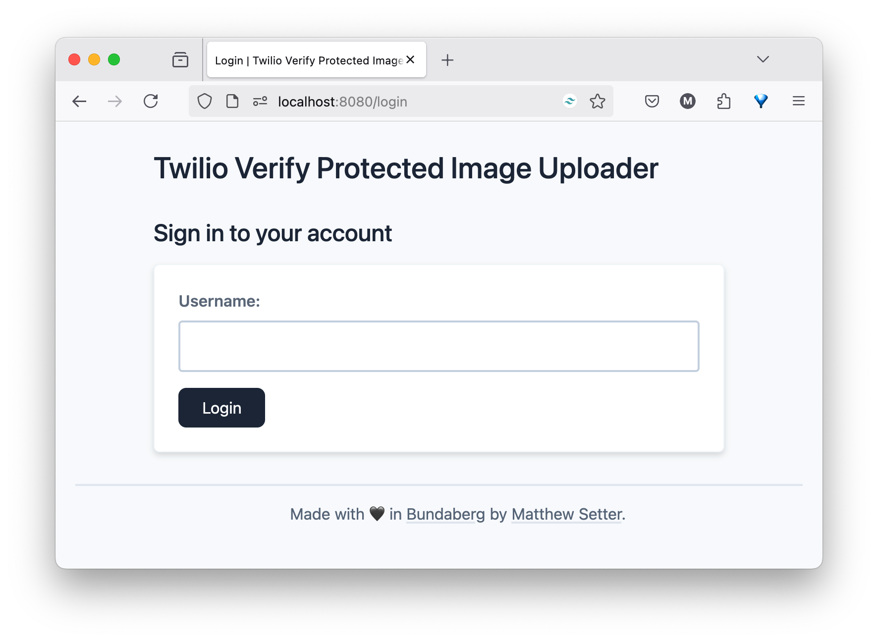
Given that, I reworked the page to place greatest emphasis on the form that the user has to fill in by:
- Creating visual contrast between the page’s background and the form, by setting the form element’s background to white, yet setting the page’s background to a mild shade of slate, and giving the form a small drop-shadow.
- Creating a visual page hierarchy, moving the form’s header above the form, under the page’s main header. The intention of this was to guide the user's eye down toward the form.
Here’s how it now looks:
One thing I didn't change was the text underline colour. You could argue, rightly, that I should do that too. However, at this stage, I’m taking baby steps towards more accessible web app designs, rather than attempting to do too much all at once.
Regardless, to me at least, in addition to looking more polished and professional, I find the page easier to use, as (and this is a personally subjective opinion) my eyes don’t have to work as hard when looking at the page.
I’m starting to appreciate the point that accessibility advocates I’ve been listening to make:
Website accessibility makes the web easier for everyone, not just those with disabilities.
It’s a fun journey into website accessibility
While I’m more or less just at the beginning, and there is so much more to learn, the more time I spend learning about website accessibility, the more I want to learn, the more value I see in it, and the more enjoyable building web applications is becoming.
If you’re interested in learning more, I strongly recommend the following resources: