Is your website (or web-based application) not performing like you expect it should? Not sure why or what to do about it? Then come learn about some key things you can do to have your website perform properly.
If there’s almost one universal constant in the modern world, it’s that business need websites.
The sites come in many shapes and sizes.
There’s the old-style “brochure” website, that just says where you can find them, their opening hours, and the basics of their service offering.
They’re nothing special, but they’re at least a point of presence.
Then there’s the brochure site combined with a blog, something that you can do pretty easily with tools such as WordPress, Drupal, and Joomla, among others.
It’s still pretty simple, but the blog keeps it fresh and up to date.
Next up, there are ecommerce sites, whether from a very small business, or for larger concerns.
And finally, there are custom-designed web-based applications, the ones that let people do all manner of things.
Yet, sadly, regardless of the type of site, they seem to increasingly have one thing in common: they have lackluster performance.
In the modern world, where website and web-based applications are effectively a must-have for any business, sole-trader, government department, NGO, etc, it’s appalling to me that they can perform so slowly.
What appalls me more, is when you look at a lot of them, as I’m increasingly spending my time doing, the reasons for the lackluster performance aren’t anything magical.
As an external consultant, I don’t often get to review the code behind the websites.
I can only look from outside in most of the time.
Regardless, there are a number of things that are all too often sorely lacking.
So, in today’s post, I want to set out what I consider a basic set of principles that all websites-regardless of scale and purpose-should follow, if you want them to perform properly.
Optimise All Image and Video Content
Most sites these days are content-rich, relying heavily on images and videos.
This can be for any number of reasons, including:
Displaying products in an online catalog
Displaying short to medium term weather forecasts
Giving the user a virtual look around a company’s office
Demoing a product images and videos are essential.
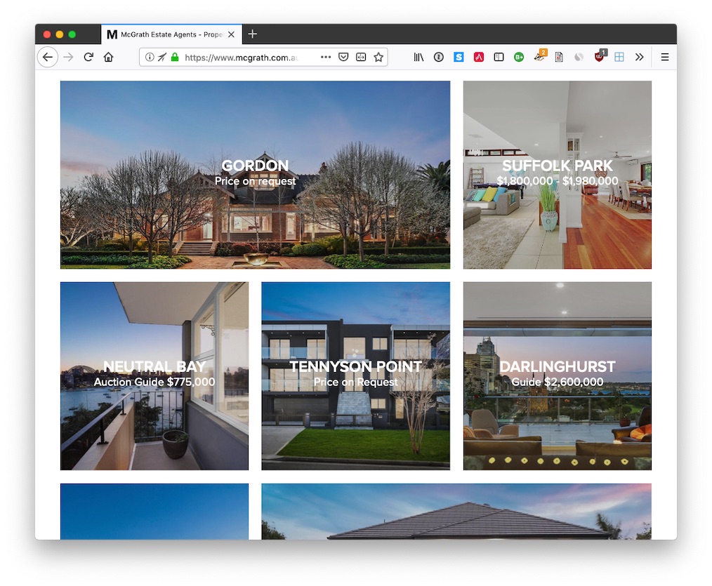
Below are two examples.
The first is of real estate agency McGrath, where high quality images are essential for showcasing properties to potential buyers and investors.
The second is the Australian electronics retailer, JB Hi-Fi.
However, from the growing number of sites I’ve been reviewing, a large proportion of that image and video content is not optimised.
As an example, one website I’ve been reviewing lately, I’ve been able to optimise most images by up to 35%!
If you extrapolate that out, if the average image size in the site was 200k, then a 35% size reduction will reduce the file to 130KB.
Sadly, an average size of 200KB is on the conservative size.
A back of the napkin calculation showed that the average image size was around 548KB.
Anyway, back to the discussion at hand.
“It’s only 70k”, you may be thinking.
What’s all the concern about?
Well, how many images are being served by your site?
Say you have around 20 images, that’s 1,400Kb per/visitor, assuming that they go through the entire site.
But Matt, the browser caches the images.
Yes.
You’re right.
After the initial site load they do — not before.
As Steve Jobs knew all too well, and as the old saying goes, first impressions count!
Consider how slow your site seems to new visitors on that first visit?
Are they wondering how long your site’s going to take to finish loading?
We all know the statistics.
They’re not going to hang around long - at all.
What’s more, speed is now one of Google’s core ranking factors.
So, now ask yourself, how many potential visitors are you losing by having them wait unnecessarily long for images and videos to load?
But that’s not the only consideration.
For every image that isn’t optimised:
You need more server space
You’re paying for more bandwidth; and
You’re paying for more server hardware to be able to cope with the download demand
But that’s not all!
In a world where mobile-responsive websites are ever-more the norm and 3G is still the average mobile network speed, the larger that your image and videos are, the poorer the performance mobile users will have with your site.
As a little exercise, have a look at your current hosting costs, and do the math to find out what you’ll save if you start optimising images and videos.
If nothing else, your bottom-line will thank you!
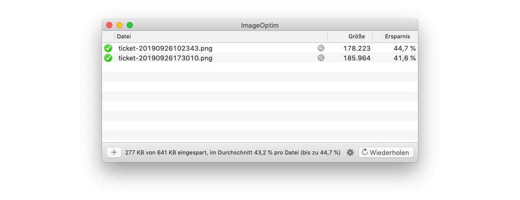
You can see an example of ImageOptim below, optimising two tickets I purchased recently.
Use any one of these to optimise your images and videos before they’re uploaded.
Alternatively, integrate the tools into your website’s deployment pipeline, so that they’re optimised automatically.
Yes, it will take a little more time at first, but it’s worth it, and it will save you so much in the long run.
Use More Modern Image and Video Formats
GIF, JPEG, and PNG have been around for years now.
They’re the image format workhorses of the internet.
However, just because they’ve been around for years, doesn’t mean that they’re still the best choice.
Your user still sees the excellent content on your site, but in less time.
What’s more, you don’t need as many server resources, so don’t have to pay as much in monthly/yearly hosting costs.
Now, not all browsers currently support these formats.
However, an increasing number of them do.
Below are links to browser support for each of the three image formats.
But it doesn’t matter if one or more browsers don’t support the newer formats.
This is because you can code your site to let the browser choose what format to serve to the visitor, based on what it supports.
You can see an example of how to serve an image in WebP, falling back to PNG format below.
In this example, if the user’s browser didn’t support WebP, it would be served the image in PNG format instead.
Yes, it’s a little more work, but it’s worth it!
Don’t Scale Images In The Browser
I’ll admit, this is a massive pet peeve (frustration) of mine.
Why, oh why, do developers still do this?
I’ll be uncharitable and say that I can only put it down to laziness or tardiness in the presence of crushing deadlines, which are, sadly, all too common in modern software development.
Regardless, don’t do it!
Sure, the image might look small to you on the screen.
It might render at the right size for your site’s design.
But that’s irrelevant.
The server’s still serving the image at its original size.
And the client’s still downloading it at the original size, before resizing it on the fly (each and every time).
Don’t believe that this happens?
Here’s a recent example, with the names changed to protect the innocent (or guilty, depending on how you look at it).
I regularly found images that rendered at around 250 - 300px wide actually being around 4032px wide.
Doing a bit of quick math, that means that the image is being rendered at around 9.5% of the original size.
So an image over 10x the size that will be used has to be downloaded, only for 90+% of it to be, effectively, immediately thrown away.
Why?!
Please.
Don’t do this.
Take a little bit more time to plan out the use of your image and video files, scale them accordingly, and save your users from poor performance.
To be fair, this might be quite a bit of work.
If so, then put a script, microservice, or background job in place that creates a number of copies which are optimised for the locations where they’re used.
Use Header Compression
Header compression, as the name implies, is where a client can request, via the use of headers, to receive content in a compressed state.
The client and server then negotiate with each other as to the compression format to use.
After that, if the server supports it, the server compresses the content and sends it to the client.
Finally, the client decompresses it on the fly, before rendering it to the user.
To be more specific, the client sends the Accept-encoding header when it requests a content item (such as HTML, CSS, and JavaScript content) from the server.
The server, if it’s been configured to support compression, will send the content compressed, along with a Content-Encoding header, which shows the compression algorithm that’s been used to compress the content.
The client then knows which compression algorithm was used, and can uncompress the content appropriately.
If that header is missing, then the content is sent back, uncompressed.
Yes, there are a couple of steps involved, but they’re all transparent to the end-user.
As an experiment, from the command line, run the following command:
Alternatively, you can use the developer tools in your browser of choice, as you can see in the image below, or a tool such as [online gzip test].
There are a number of common compression algorithms in use, with the most common being gzip and deflate.
I currently use gzip compression as it’s very flexible and has greater reliability than deflate.
Compression can be applied lightly, or you can eek out every last saving you can, by setting the compression level to 9.
«flesh out this a bit further»
What’s more, you can configure the resource types that will be compressed as well.
You may just want to compress HTML content, then just do that.
You may only want to compress CSS and JavaScript files, then just do that.
You may want to compress every possible content type, which may often be the case, then do that.
I’ve included an example of how to configure GZIP compression with NGINX for all content types, below:
Taking again, my website as an example.
The HTML content of the home page weighs in at 25.2KB.
However, by using compression, only 7.8KB is sent by the server, which is only 30% of the original file size.
Use Caching Headers
I’ve spoken a lot up till now about image size, and image optimisation, but what about being able to specify if a content item needs to be sent at all?
That’s where caching comes in to play.
If you think of a typical client/server interaction for loading a standard website, the client will download all the static content along with the HTML, whether that’s images, videos, CSS, JavaScript, etc.
But, if this happens on each request, then that can be very demanding on the client, the server, and on the connection between both — along with every point between the two.
So, in addition to optimising and compressing content, you need to make use of caching headers.
That way, the client can determine if it needs to request the content at all.
Because, if the server tells it that a static content item hasn’t changed since the last time a request to the site was made, then there’s no need to download it again.
An in-depth discussion of caching headers is outside the scope of this article, however Heroku has an excellent guide, if you’re keen to know about it in greater depth.
For now, there are four headers that you need to familiarise yourself with:
Cache-Control: This header determines if the content can be cached by the client and any proxy between the server and the client.
Expires: This header sets the date from which the cached content has expired.
Last-Modified: This header sets the date on which the content was last modified.
If-Modified-Since: This header allows for a conditional request to be made. If the Last-Modified header is earlier than the value provided by the If-Modified-Header, then the server will supply the resource. If the item’s not been modified since that date, either an empty body or an HTTP 304 will be returned to the client.
ETag: This header is, effectively, a digest of the contents of the requested resource.
If-None-Match: This header allows for requesting resources where the ETag value has changed.
Use the Latest Version of Your Software Language
If you’re a veteran of the IT industry, this might sound wrong.
After all, there’s an old saying in tech: if it ain’t broke, don’t fix it.
In many instances, that can be perfectly valid.
But in software languages, it’s often wrong.
Here’s why.
Often times — especially in PHP — the most recent versions of a language:
Offer significant performance improvements over older versions
Contain a range of bug-fixes
Simplify how a site can be developed
Of this list, for this post, the first two are the most important.
Take PHP as an example.
Official PHP benchmarks report show that it can execute twice as many requests per second when compared to PHP 5.6.
How many more visitors could your site serve and how much lower would your hosting resources be with that kind of performance improvement?
It’s a double-win.
Actually, it’s even more so, when you consider that virtually no code changes would be required, in most cases.
Yes, some older applications and sites will need to go through a careful migration.
But, if they’re written even partly well, combined with static analysis tools, such as Phan and Psalm, migration is readily achievable.
Use the Latest Version of Your Server Software
No matter what server software you’re using, whether that’s NGINX, PHP-FPM, Apache, Tomcat, IIS, or whatever else you use to power your website, make sure it’s up to date.
As with having the latest software language, keeping your server software offers the same set of benefits.
It’s outside the scope of this article to cover the changes in any one server software, let alone all of them.
So I strongly encourage you to review the changelog for the latest, along with the most recent versions of the server software you use, see what’s changed, and then make the upgrade.
Yes, there will be circumstances which may limit the extent to which you can upgrade, but go as far as you can.
That’s a Wrap
Those have been seven ways to speed up the performance of any website or web-based application.
It doesn’t matter whether you’re running a small brochure site or a custom web-based application, each of these recommendations can help:
Improve user satisfaction
Increase conversions and sales
Make your site perform better
Reduce the download size
Reduce your impact on the environment; and
Reduce your server costs
No matter which way you look at it, these are goals worth achieving.
Ever wanted to dynamically expand the functionality of an object which you retrieve from your dependency injection container, based on different needs, yet without creating messy, hard to maintain configurations? Then you’re going to want to know about a powerful new technique - called Delegator Factories.
If you need to migrate Zend Expressive applications from version one to two, don’t do everything by hand! Save yourself time, and make use of Zend Expressive Tooling.
For the longest time, Zend Framework hasn’t had the strongest support for command-line tooling and scaffolding. However, in recent times, that’s all changed. Come find out how to use Expressive’s new tooling support to create modules and middleware rapidly.
Laravel’s Eloquent ORM isn’t likely the first one you think of when using Zend Expressive. You likely think of Zend\Db or Doctrine. But, with a little bit of work, it’s possible to use Eloquent with Expressive. Today’s tutorial shows you how - step-by-step.


Join the discussion
comments powered by Disqus